Beneath a muted palette, subtly contrasting textures play across this Grand Harbour family home, a livable fusion of classic and contemporary design.
 Some houses are defined by a ‘look-at-me’ feature; others are the sum of their parts. This newly built four-bedroom residence at Grand Harbour exemplifies the latter category – its beauty is in how the elements harmonize together, those decorative masterstrokes that quietly make the space more inviting and livable.
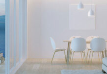
The clients, a Caymanian-American couple with two young daughters, knew they wanted visibility through to the canal as well as effortless connectivity between rooms. Enlisting local architect David Towell, a floor plan was drawn up to include a large indoor-outdoor family room with folding glass doors, leading through to a communal kitchen – the hub of the house – with an eat-in breakfast booth. The layout lets family life unfold fluidly between rooms and maximizes waterfront views.
A fine balance
The brief for interior designer Lydia Uzzell, meanwhile, was to strike a classic-contemporary note and, above all, create a space that feels personal, not like a showroom. “It’s about achieving a level of sophistication without sacrificing comfort or appearing overdesigned, so when people come in they feel really comfortable. They can put their feet up,” she explains.

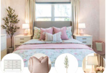
Sourcing a slightly eclectic mix of traditional and modern pieces for each room was key. Take the master bedroom, for example, where antique-looking nightstands and a four-poster bed are offset with contemporary abstract paintings in gallery float frames, and modern detailing on the headboard. “Introducing subtly different timbers also helps to create an effortless ‘oh, we just threw this together’ feel,” Lydia says.
Juxtaposition continues throughout the home. Two styles of upholstered chairs are mixed at the dining table, one set with tufted detailing, while acrylic-framed abstract artworks hang on the wall. In the kitchen, a modern glass-and-stone mosaic backsplash is paired with more classic cabinetry.
“There is contrast and drama, yet it is very proportionate. It doesn’t jar,” Lydia explains, pointing to the dark wood tones that are picked out in the artworks. Her team was mindful of balancing masculine and feminine elements; the identities of husband and wife. For every fun-patterned or beaded cushion there is a plain, slate-gray one; for each delicate crystal pendant, a simple geometric pattern or heavier wooden piece.
Nor was the powder room overlooked: “We like this to have a bit of detail, so guests have a takeaway from the house, a snapshot of the home’s style,” Lydia says. In this case, there is a textured and subtly patterned wallpaper as well as bead boarding and an antique finish to the mirror – a neat distillation of the home’s aesthetic.
The art of layering
Inspired by the clients’ love of oceanic colors, a restrained palette of pale blues, navy and smoky grays is used throughout the property. Texture is therefore the linchpin to ensure the space feels multi-dimensional – and will be more forgiving to the wear and tear of family life.

The team selected furniture with a timeworn appearance, and fabrics with open, natural textures (such as a gorgeous textured linen in pale blue for the sofa) rather than finishes that would highlight every mark and wrinkle. Upholstery textiles were also treated with nanotechnology for added resilience.
“When you have dogs and children this is important,” says Lydia. “You can have this pretty house, but you don’t have to constantly be worrying about messing things up. No one wants to live like that, especially here in the Caribbean.” Accordingly, the space is far more durable than its sophisticated aesthetic would suggest.
Again, with an eye on practicality, a quartz product from Santa Margarita was sourced for the bathroom vanities as it has the appealing veined look of natural stone yet is easier to care for.
Nowhere is durability more important than in the girls’ suite, their two bedrooms connected by a ‘Jack and Jill’ bathroom. A vibrant Polypropylene rug was selected for the seven-year-old’s room, a material often used for outdoor furnishings and is “pretty much indestructible,” according to Lydia. The little girl was especially opinionated and excited about designing her room, helping pick out fun, whimsical accessories – throw pillows from Hollywood at Home, glass doorknobs, fairy and pendant lights, and a faux fur throw.
Devil in the detail

“Artwork, accessories and throw pillows – these are the things that completely define and make a space,” Lydia advises. “They give you a higher return in terms of visual impact.”
At Grand Harbour, loading up on throw pillows instantly enlivens everywhere from the breakfast nook to the living room with color and character, while in the master bedroom a pair of stacked crystal lamps adds a glamorous touch. The kitchen’s striking lighting feature, a modern take on a glass lantern, was chosen as it has real presence and yet does not interrupt views through to the canal.
Window treatments with cartridge pleat drapes are another subtle yet important space-enhancer. “Drapes lend so much to the finish of the room… it’s kind of like putting eyeliner on!” Lydia says.
In fact, the longer the eye lingers upon these rooms, the more those clever little touches and connections emerge: A quirky coffered ceiling, for instance, or a nail head trim on a chair. How the curved edge of an ottoman echoes the shape of the coffee table’s legs.
Tricks of the trade
The home’s interconnecting and somewhat unconventional layout, though perfect for the family’s lifestyle, posed some potential challenges for the interior designers.
With a U-shaped hallway wrapping around a family room, this space is effectively a thoroughfare with three entrances. Lydia’s solution was to create a contained ‘space within a space’, using an area rug to visually and psychologically define the lounging area, so there is a feeling of coziness and intimacy, and the thoroughfares no longer seem to encroach. The same tactic was deployed for the dining room.

As for the kitchen, this space was configured to allow people to socialize without getting under each other’s feet, keeping the refrigerator, wine storage and bar area to one side, the cooking and pantry facilities on the other. The master bathroom also called upon a stroke of design ingenuity, as the only window is located directly above the vanity. The solution was to overlay the window with pivoting mirrors, allowing natural light to flood in.
The home’s cohesive blue-gray palette continues through to the indoor-outdoor lounge and deck, where outdoor furniture is of softer, lighter style than the espresso finishes often seen on-island. With a large swimming pool melting into the canal view, no doubt this will be another popular space for the family to relax and entertain in.
Sophistication is not traditionally a bedfellow of comfort and practicality. But the house at Grand Harbour proves a harmony between the three can be struck – the devil is just in the detail, and a skillful eye for texture.


